This is a possible lecture for High School classes: CMT 11, Design 10/11, Ext 11/12. Topics: Design choice, font, photography.
WHY SPEND TIME CREATING A STRONG IMAGE?
At Family Fun Halifax, part of my job is to create engaging feature images that will appeal to the readers, and draw attention to our content through social media. They need to draw the eye in, and make the reader want to click through. A good understanding of the market (what are my readers interested in?), photography (framing, angle, lens, rule of thirds) and font choice (branding) is important.
FONTS = BRANDING
In this case, 3 fonts were pre-selected by our company to maintain a strong brand.
RULE OF THIRDS IN PRACTICE
Note how incredibly important the rule of thirds becomes when trying to fit a chunk of text: “5 Awesome Family Events…” for each picture.
SOCIAL MEDIA
Once published, these photos make appearances across several online platforms. You have to eye up the photo and imagine what Twitter and Facebook will do to it. For example Twitter makes it square, so you have to try to keep all your text away from the edges.
TOOLS FOR THE JOB
Tools used: Shutterstock stock photos , or original photos taken with i phone or digital SLR camera. Pic monkey (free online photo editing software- actually superior to Photoshop for this type of task). Finally, in WordPress – each photo must be allocated an “alt tag” (a description of the contents of image) to allow Google to search it effectively.
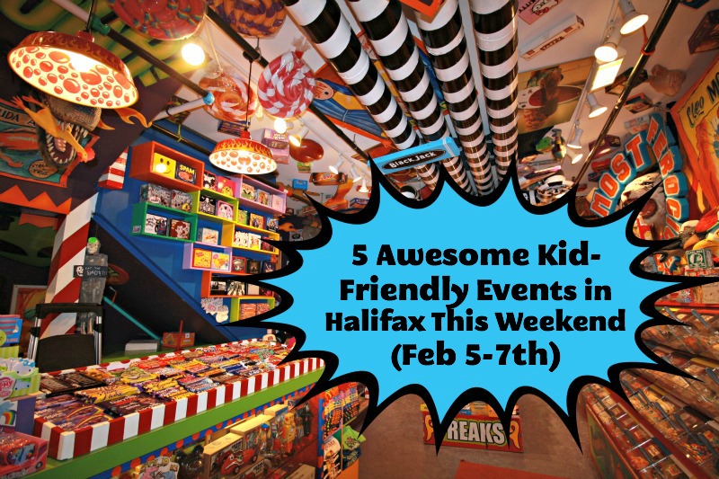
This was a great photo to begin with – taken with a wide angle lens at the Freak Lunchbox on Barrington Street. I thought the comic voice box was a really good fit. The colour is eye-dropped from the fake gum on the ceiling.
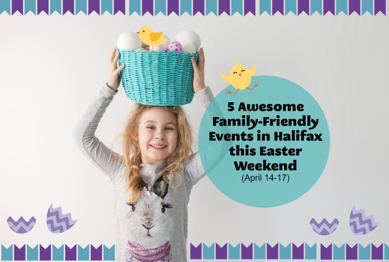
Easter- used a lot of fun tools from Pic Monkey.
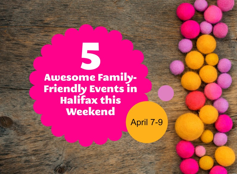
This was a stock image that we bought from Fotalia, an online stock photography library. They have a lot of photos that leave space for text. I used three overlays – a fun shape and two circles, to match the little balls that were in the photo. I used one of our main fonts: Megalopolis Extra for the main title, then one of our secondary fonts: Lato, for the date. To match the colours, I used the eyedropper tool. It took ages to get the balance right – I wanted it to be off-centre, but still balanced. The theme of the post is bright, spring, Easter. This was published the weekend before Easter.
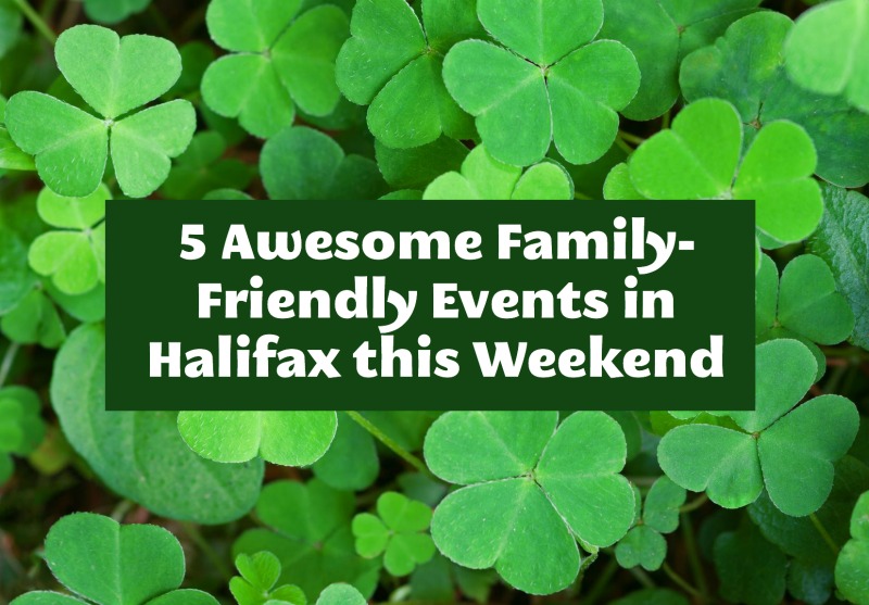
It’s not hard to guess which week this round up was for. A stock image of shamrocks was used as a background. Using pic monkey I applied a rectangular overlay, coloured it green with the eyedropper (i picked a dark green out of the background) and then just used the Megalopolis font for the title. Boring, but “does what it says on the tin”!

Using photographs of other people’s children. Always ask permission. Here, although the child is not easily identifiable, I still asked his Mom whether it was OK to use the pic.
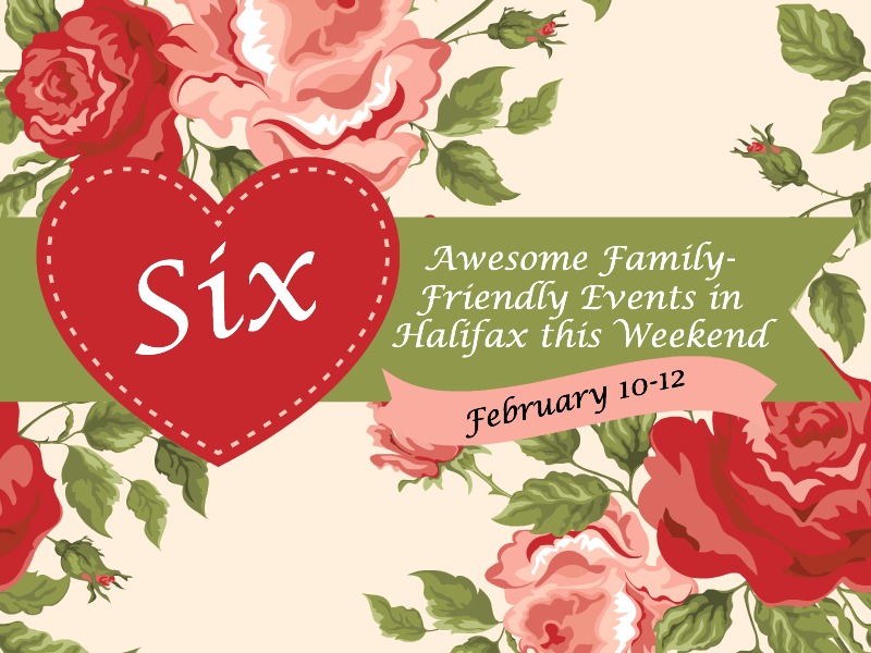
This looks simple but it was quite a complicated image to create, for a Valentine’s Day theme.

Winter shot using stock photograph.

Winter shot. The initial photograph had a nice wintry bokeh effect in the background.
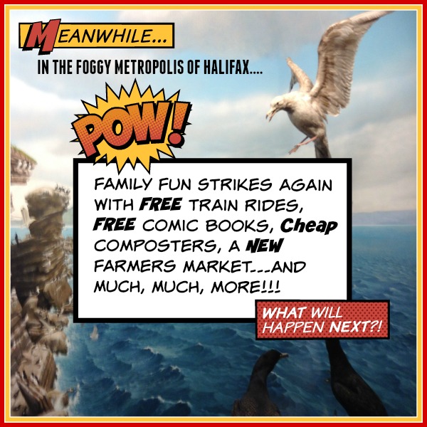
Comic Book Day. My favourite photo. The background is a photo I took at the Museum of Natural history in Halifax. I spent about an hour on this one!

A cappuccino from Local Jo’s makes the perfect backdrop for a title.
Possible Task: examine other blogs and online magazines. Find a feature image and analyze it in terms of subject choice, type of photograph (natural or stock), framing (rule of thirds), font type (branding) and, most important “WHAT IS THE OVERALL MESSAGE?”
I hope you have enjoyed this presentation!
Helen 🙂


